Content is a key element of just about any page. No wonder it can make or break the user experience your site provides.
Have you ever thought about your content strategy in the context of user experience? Is your content user-friendly and accessible?
Here are three ways (and three tools) to improve the user experience of your content:
1. Align Your Content with User’s Expectations
Poor content that doesn’t prioritize its reader is by default poor user experience. But what exactly does “poor” mean when it comes to a copy?
There are numerous ways to define and evaluate content quality. We can talk about length, depth, readability, clarity, and comprehensiveness of a copy and still fail to explain why we think we are dealing with a poor copy.
The problem is, content quality is subjective. What one thinks is a shallow copy is a perfect article explaining the basics for someone who is less familiar with the topic.
This is why the best way to define a poor copy is from a target reader’s perspective.
In other words, a high-quality page is the one that satisfies a searcher’s intent, or the one that meets searchers’ expectations.
Tools for Fulfilling Your Searcher’s Intent
How do we know if our content fulfills the searcher’s need?
- Clearly understand who you are writing for: Define your target reader’s profile (or persona) to better relate to their needs. Are they experts or newbies? Travelers? Stay-at-home parents? Which challenges are they facing on a daily basis? Why did they turn to Google to search for this particular query you are targeting? Talk to your customer service team to better understand your target audience. Take this Unified Communications Test to set up an effective knowledge sharing process within your company.
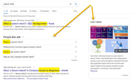
- Keep an eye on Google clues: What search elements is Google showing for your target search query and what do those tell you about people searching for it. Are there video carousels showing for that search? Do “People Also Ask” boxes include broad or specific questions? Do top-ranking pages provide in-depth or 101-type of answers? Google knows their target searches. They have had years of data to analyze their users’ searching patterns for all kinds of data. All you need is to be able to see Google’s hints.
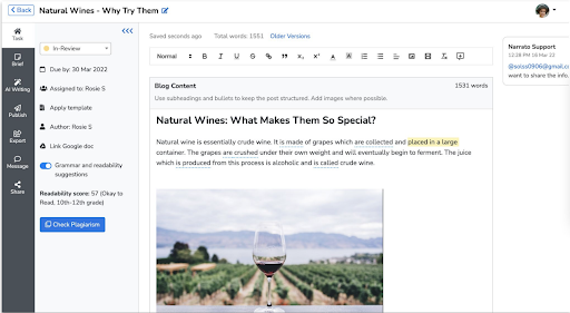
Narrato WorkSpace is a great platform to put all of these multiple pieces together. Narrato allows you to keep all your content workflow (ideation, research, creation, editing) under one roof empowering your team with research, collaboration and AI writing tools. You can add projects, invite collaborators and let your team create content together:
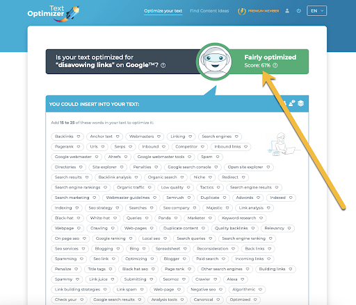
Finally, use Text Optimizer to grade your writer’s intent optimization efforts. The tool uses semantic analysis to help you create a copy that matches your target user’s expectations: the higher your content is graded, the better it satisfies your searcher’s intent!
2. Build an Effective Content Structure
Organize content into well-defined sections using headings, (ordered and unordered) lists, and visual elements (icons, graphs, etc.)
This helps on many levels and makes your content user-friendlier:
- Subheadings help readability because people can scan them and quickly decide if that’s something that is going to be helpful for them
- Clearly visible subheadings that stand out improve engagement as they prompt readers to stop scrolling and read a section that seems to be the most relevant to their particular needs
- Content that is broken into logical sections is easier to remember and follow
- Well-written subheadings help accessibility as it helps blind web users to navigate the page using screen readers. Another way to help people with disabilities navigate your content is to create video subtitles.
Break content into shorter sections with appropriate subheadings (use true and visually significant headings rather than simply big bold text) and create a clickable table of contents to help your readers to easily navigate to the most relevant section..
You can review your content structure by using the free tool called Wave by selecting the Outline View.
Each page should typically have one main <h1> and multiple subheadings that follow the logical hierarchy (they should not be skipped). The tool will alert you of any structural errors like skipped or missing subheadings, too long headings, etc.:
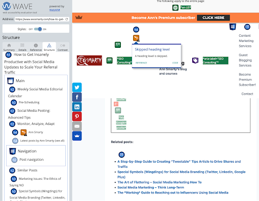
Additionally, the tool will check your lists that also provide semantic meaning: orders, unordered, and definition lists.
Keyword clustering (i.e. breaking keyword lists into groups by meaning) is a great way to create a logical content structure and rank for multiple keywords within a single group.
3. Eliminate Confusing Page Elements and CTAs
Even great content will fail to engage a reader if it is full of confusing and distracting CTAs or other (often redundant) page elements.
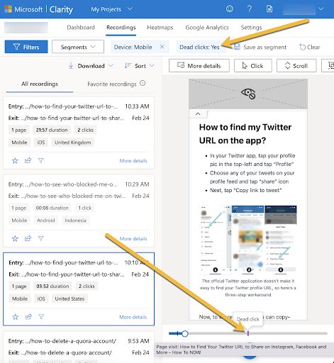
One of the best ways to identify those page elements that prevent your page visitors from reading your content in full and/or engaging with it in any way is using a free tool from Bing called Clarity.
Clarity is pretty easy to install: You need to connect it with your Google Analytics account through standard Google’s authentication process and then install Clarity’s tracking code. This way the tool will have two reliable sources of data (GA and its own pixel) for more in-depth insights.
As soon as it is installed, Bing will need at least 24 hours to accumulate and process your data. From then on, keep an eye on “dead clicks” insights that show you page elements that people clicked and tapped with no results (i.e. those page elements are easily confused with clickable links, buttons, etc.). You can view the recordings of people using your site and clicking/tapping:
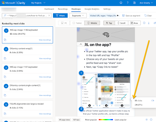
Or you can use Clarity’s heatmaps to identify page elements that attract most “dead clicks”:
Bing promises that the tool will be free forever!
More Tools for Optimizing Pages
There are quite a few on-page engagement solutions for you to experiment with and test with Clarity. If you are using standalone content assets, pick a content management system that already has a smooth conversion funnel already built-in. There are a few great webinar platforms, for example, that have that done very well.
Page speed is another big factor that can make or break on-page user experience. Keep a close eye on that as well. Google’s Search Console will alert you of any issues with your page performance, and if you are using a flexible content management platform, you may even be able to fix it in-house. Both WordPress and Shopify offer built-in solutions and integrations for page speed optimization.
Conclusion
Content user-friendliness is one of the key elements of its success. Your copy can be great and truly useful but it will fail to perform well if it is hard to read or impossible to engage with.
Optimizing your content strategy to provide a positive user experience is crucial for achieving high rankings (as user experience is a confirmed ranking signal), improving your conversions and building a solid backlink profile.