If you’ve ever seen a graph, infographic, or statistical map in a news story, then you’ve been exposed to data journalism. Data is great for journalists to use because it can act as a source and help explain complex stories to an audience in a more digestible, visual way.
“I think many content creators have realized you can use data visualization as a way to tell the story within seconds,” says Ryan Sammy, Director of Creative at Fractl. He’s part of my team who recently looked into the history of data journalism and what creative experts think about the future of data-based reporting.
Pioneers of Data Journalism
Sammy points to The New York Times as a prime example of a publication that uses data well, notably when the publication cleverly used animated shorts to put Olympian achievements into perspective. “The New York Times sets the benchmark for what is possible,” Allison McCann, former Visual Journalist for FiveThirtyEight, tells Fractl when asked what sites or other resources she looked to for inspiration.
Andy Kirk, a freelance data visualization expert, agrees. “Newspapers are at the core of the very best practices in this field, such as The New York Times, South China Morning Post, and the Financial Times.”
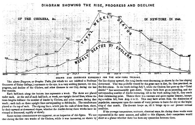
With 75 percent of companies increasing their content marketing budgets in the coming year, you’d think data journalism through content creation was a new way of storytelling, but it’s hardly a modern concept. Scottish engineer and political economist, William Playfair, first dreamed up the methods to display statistical data back in 1786. But it was The New York Tribune that published a line graph showing weekly Cholera deaths in New York in 1849, which became one of the first solid examples of data journalism covered in a major publication.
But data journalism remained widely unused until the 1950s, when journalists began using computers to predict the results of the elections. Navy mathematician Grace Murray Hopper and her team of programmers used a computer to accurately predict—within one percentage point—the outcome of the 1952 election. Yes, even then people were eager to find out who would become the next President of the United States before the election was even over.
Data Journalism Is on the Rise
Though data-driven content has been around a while, Fractl has seen a drastic increase in the use of data journalism in recent years, particularly data that is displayed in charts and maps. “We’ve seen an explosion in information and tools to help interpret that data in the past 10 years,” says the creative agency.
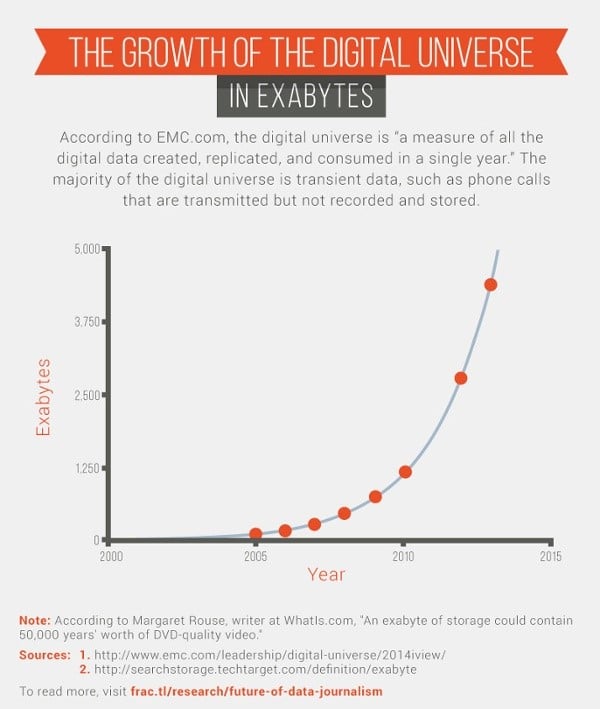
In the last decade, the size of the digital universe (defined as all of the digital information that is created, replicated, and consumed in a single year) has grown by a factor of 33.
In 2005, we saw a big boost in news stories that incorporated data visualizations, around the time when U.S. programmer Adrian Holovaty created a Google mash-up using Chicago crime data. The project sparked a lot of interest in journalism and mapping among programmers, so much so that The New York Times featured it in its 2005 “Year in Ideas” issue. The project won the 2005 Batten Award for Innovations in Journalism.
Inspired by Holovaty, the Tampa Bay Times created PolitiFact in 2007, a site dedicated to fact-checking political statements, where they “make each piece of the visualization count,” according to one of the publication’s data reporters, Nathaniel Lash. Nearly a decade later, we saw Democrat presidential candidate Hillary Clinton use a similar tool to back up her and her opponents’ claims made during the debates. Within just one hour of Clinton mentioning it, nearly two million people flocked to her site, proving just how eager people are for truthful, fact-based stories.
But Google mash-ups and PolitiFact were just the beginning in this spike of rich data. In 2010, Wikileaks stayed true to its name and released thousands of documents related to the war in Afghanistan, giving exclusive access to The Guardian, The New York Times, and Der Spiegel to cover the story the very same day. This year, The Wall Street Journal created its own in-house team dedicated solely to creating data-filled graphics. Meanwhile, Reddit’s data visualization community /r/dataisbeautiful/, reached a whopping seven million subscribers.
If this graph tells us anything, it’s that these breakthroughs in data journalism are only going to continue.
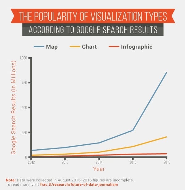
Charts and Maps Take the Cake as Most Popular Data Visualizations
When it comes to the most popular data visualizations, charts and maps dominate, according to Google search data. In 2012, there were 68 million Google search results for “map.” Between January and August 2016, there were over 12 times that number!
It’s no wonder that publications like The Guardian and The New York Times launched their own data blogs in 2009 and 2014. According to The New York Times, the goal of their new venture Upshot is to “help readers better navigate the news using data, graphics, and technology.”
If the history of data journalism has taught us anything, it’s that people will always be hungry for data visualizations and content that unveils both solid, research-backed facts and stories that evoke an emotional response—whether those emotions be positive, negative, or surprising.
[contextly_auto_sidebar]
What Does the Future of Data-Driven Content Look Like?
When we picked the brains of seven content creation experts and asked them their predictions for the future of data-driven visualizations, it was clear that data journalism isn’t going anywhere anytime soon—and it’s only going to get bigger and better.
Katie Peek, former Information Graphics Editor at Popular Science says, “I have more of a wish list. I would love to see people’s personal data, like their electricity bill or their health data, presented in a way that’s clear and doesn’t require you to be super numerate in order to understand. This is starting to happen already.”
The world to 2100, my latest for @sciam. Spoiler: It’s gonna be hotter. https://t.co/DzsERK7R0B pic.twitter.com/QDXewLhzVw
— Katie Peek (@kathrynpeek) August 25, 2016
Matt Daniels, Editor and Founder at Polygraph, is enthusiastic about the future of data journalism and predicts, “We’ll see more data visualizations. It all comes down to better tools. Better tools lift the sea levels, and everyone’s ability improves. My outlook is positive.”
New Project! Every hip hop label, sorted by their artists’ chart performance on Billboard: http://t.co/kYWjHWNaDi
— Polygraph (@polygraphing) October 8, 2015
Matt also pointed us to his post, which outlines more of his thoughts on the future. “The Internet has grossly undervalued our intrinsic interest in visualization. I expect the market for this sort of content to explode.”
Kristin Tynski, Co-Founder and SVP of Creative at Fractl, predicts an advancement in tools will impact the future of data-driven content. “New and increasingly sophisticated tools are emerging that will allow us to uncover hidden aspects of data that we were never before able to see. Machine learning will certainly impact this field even more significantly than it ever has before. Tools that bring data visualization technologies to the masses will become even easier to use and more intuitive.”
Here’s a look at #viralcontent and the emotional triggers that make us click share: https://t.co/6ZgW1iycsA
— Kristin Tynski (@kristintynski) July 18, 2016
Kristin foresees we’ll also be presented with more readily available data sources. “We can expect more and more organizations, governments, and businesses creating public portals for their data as they realize the power of the crowd to find insights into public data.”
Nathaniel Lash at Tampa Bay Times is “excited for more intuitive and feature-rich tools that people with more of a design and graphics background can use without coding too much.”
This was a tough one. Proud of the deep, empathetic work by my colleagues @TB_Timeshttps://t.co/Aehn1NYL5G
— Nathaniel Lash (@Nat_Lash) June 20, 2016
After 230 years of data-driven content creation, it’s clear that using data is not only routine for journalists in the newsroom, but also a driving force in storytelling, particularly as technology, methodology, and sources continue to expand. If these content creation experts (who are clearly ready to take on more and more data) are right about the future, we’ll be seeing an influx in advanced tools that will not only simplify the process of sorting through data, but allow for more institutions to use data to explain and contextualize current events as well.
Do you have any predictions about the future of data journalism? We’d love to hear your thoughts in the comments section below.
Get more content like this, plus the very BEST marketing education, totally free. Get our Definitive email newsletter.