When you need to influence your audience, data is one of the most powerful tools in your arsenal.
Data provides the proof that you require to justify your actions. For instance, managers and executives could use it to inform their corporate decisions. Similarly, marketers could use it to build a case for their products with customers.
However, since you understand your industries and the key metrics, it’s easy to assume that people outside your niche understand the data as much as you do.
And that’s where the different ways of data storytelling come in.
By making use of visuals to convert hard data into a convincing story, you transform otherwise boring or confusing numbers into easily understood concepts.
In this post, I will show you how to use different ways of storytelling to enhance your engagement with other people.
Let’s get started.
What is Data Storytelling?
Data storytelling is the process of transforming data and statistics into clearly understood concepts to drive home your message to your target users.
You need to use the right data and analytical facts that will intrigue your potential clients and compel them to act on your offerings.
Success with the different ways of data storytelling depends on the subjects, stories, visuals, and creativity you use.
Also, applying cutting-edge tools and technologies to analyze different metrics and generate insights from them will help you come up with a compelling narrative for your data story.
And once you’ve got the narrative in place, you can get started with data storytelling.
What you need to do is identify a narrative, find data to support it, and create a plot that presents the complicated concepts in a manner that’s easy to understand.
From this definition, you can see that data storytelling has 3 key components:
- Data – Accurate data analysis is the foundation of data storytelling. Use descriptive and predictive data analysis methods to clearly understand your data.
- Narrative – Create a storyline to communicate valuable insights derived from the data.
- Visualization – Use visual storytelling tools like charts, images, diagrams, and graphs to communicate your story clearly.
The Importance Of Data Storytelling
There’s more to data storytelling than it being an interesting way to share complex information with your audience. It’s numerous benefits to organizations include:
Captures the Attention of Audiences
People tend to prefer visuals over any other form of content as they can convey information with ease. Visuals also make it easy to understand complicated concepts without having to read through walls of text.
Using the best graphic design software, you can create visually-appealing presentations that provide actionable insights to your audience. Choosing the right design tool is an important factor. Attrock prepared a list of the best graphic design tools with a detailed description of each tool.
You can review and compare tools’ features and prices and can select a graphic design tool that is the best suited for your requirement. It will help you drive more conversions.
Delivers the Key Message Quickly
We live in a fast-paced world where your audience would want the information to be communicated to them with ease. The different ways of data storytelling allow you to present complex information in an easily-digestible manner to the final consumer. From images to videos, you can use them all to share information with your audience.
Helps People Make Better Decisions
Since it’s easier for people to process visuals better than any other type of content, you can use data visualization and storytelling to help them make decisions with more accuracy.
By compressing complex data into simple concepts, you help your audience understand the issues that affect them and inspire them into action.
5 Effective Ways of Data Storytelling
Let’s now take a look at the top ways of data storytelling you can use to ensure that your data insights reach the right people.
Standard Reporting
Your regular reporting allows you to use data to tell a story about the organization. For example, you can use charts and graphs to demonstrate the effectiveness of the actions the company took.
If you bought a new software, use a graph to show how the software helped you increase productivity and save time. Make sure you quantify the improvement with hard data to justify the additional investment.
In standard reporting, you use dashboards and templated reports to save time.
However, some people in the organization may feel overwhelmed with such reports and may not query the data properly.
To prevent this from happening, prioritize visuals in your report to make the information easy to digest.
You can then easily circulate these reports among the key stakeholders.
For instance, see how We Are Social uses data storytelling in the form of a visual presentation.
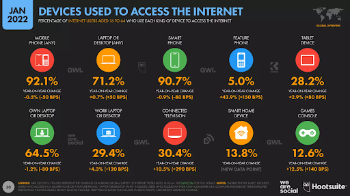
Image via We Are Social
Talk to People in the Organization
Though it sounds obvious, talking to people is one of the key ways of data storytelling.
Whether it’s through Slack messages, email, or a phone call, direct communication is an effective way to ensure data insights are listened to and understood.
Integrate a CRM with an email marketing tool to manage your email communication automatically in a single place and systematic way.
Once you are sure of the insights you want to communicate, you can reach out to your target audience and talk to them about your findings.
For example, when you realize that the company generates more leads through a certain channel by analyzing your marketing data, you can share this information on the company Slack channel.
You could choose to create a short video about it too. And if you’d like to keep it bite-sized, you can cut your video into multiple videos and share those with your audience.
From the insights, the company can decide to invest more in that channel and limit payments elsewhere.
The good thing about direct communication is that no time is lost in structuring communications and it can lead to quick actions.
However, this style of data storytelling may not be suitable for all audiences. Additionally, you may not be able to convey a lot of data through this at a time. It’s best to use this storytelling method for individual insights.
Using Dashboards
Dashboards are one of the most popular ways of data storytelling. Marketers use them for analytics and optimization and this enables easy sharing of customer experience data with other interested parties.
The downside of telling a data story with dashboards is that these dashboards are not suitable for all audiences. That’s because dashboards usually contain loads of information, which can easily overwhelm your audience. So, choose this method based on the people who’ll be seeing the data.
Infographics
You can also use infographics to tell a data story in an engaging manner. When used properly, infographics are one of the best ways of data storytelling.
The best part about infographics is that you can use them to quickly convey all the key information about your data using both text and charts. This enables you to easily convey things to your stakeholders.
However, you need to understand that you may have to invest a lot of time and effort to create the best infographics. Typically, you’d require the assistance of a graphic designer.
Meanwhile, you can repost someone’s IG story who posts a viral infographic related to your niche with creative captions. It helps you get good impressions and engagements from reposting others’ stories on your social media profiles.
For example, if you are a family lawyer you can follow the best specialist divorce lawyers, and family lawyers and learn from them, and how they are promoting themselves also share their stories, and posts. Also, mention them while sharing their infographics on your social media posts to boost your personal brand awareness.
Newsletter
You can use your monthly newsletter to tell a data story. In the newsletter, you can use data and visuals to tell what’s happening in the business as well as communicate your success and developments.
While this is most likely going to be customer-facing data storytelling, it’s still important. That’s because providing hard data to your customers and audience might just be the thing needed to convert or retain them.
The issue with newsletters is that you need to bring together a lot of content for them to be valuable. But even with all the effort, it’s highly likely that people will not read them when they land in their inboxes.
Conclusion
Whether you are engaging potential customers, executives, or investors, effective data storytelling transforms boring datasets into captivating visuals that are memorable, influence decisions, and inspire actions. It also ensures that your data insights are conveyed properly.
So, go ahead and start using these tactics to tell your data story.