Accessible website design ensures that everyone – including users with disabilities – can engage with your website effectively. One of the best ways to design your own successful accessible website is to look at other accessible website examples, so you can better understand what users with disabilities, limitations, or impairments might need to facilitate an enjoyable and engaging user experience.
In this article, we’ll explore 17 leading accessible website examples to give you actionable insights. We’ll start with a look at basic accessibility features commonly implemented and then dive into real-world examples from various sectors, from small e-commerce sites to big-name brands.
Understanding web accessibility
Making your website as accessible and inclusive as possible is now more critical than ever. With 15% of the global population experiencing some form of disability that inhibits them from interacting with a standard website, website accessibility is a priority for organizations worldwide.
Creating your website to be as accessible as possible has a two-fold benefit. First, it demonstrates your commitment to being an inclusive organization that serves people from all backgrounds. Second, it broadens your reach, giving your website a better chance to convert more potential clients. Accessibility issues and a lack of accessibility help on any modern website will hinder user experience and limit the website’s reach, so optimizing digital accessibility is now an important business decision.
The best way to get an understanding of web accessibility best practices is by familiarizing yourself with the Web Content Accessibility Guidelines (WCAG) as set out by experts in the World Wide Web Consortium (W3C). These accessibility standards aim to help web designers, and developers create a website accessible to as many people as possible.
These guidelines are that a website should be perceivable, operable, understandable, and robust.
- Perceivable: In web design, the principle of being ‘perceivable’ means that content should be presented in a variety of formats—text, audio, and visual—to cater to diverse user needs. This practice of presenting content in multiple mediums so it is ‘perceivable’ ensures that all users, whether they rely on screen readers or prefer transcripts, can fully engage with your website’s content.
- Operable: ‘Operable’ design means intuitive navigation. According to WCAG, websites need to be designed with straightforward menus, logically arranged clickable elements, easy-to-use scrolling, and alternative navigation methods like keyboard shortcuts, all of which contribute to a site that is both user-friendly and accessible to those with mobility limitations.
- Understandable: For a website to be ‘understandable,’ the content and layout must be clear and intuitive. That means using straightforward language, unambiguous directions, and streamlined processes. An understandable process means it’s easy to fill out forms, checkout, or find pertinent information.
- Robust: The ‘Robust’ principle means that your website is usable by as many people as possible across various browsers, devices, and assistive technologies like screen readers. It’s a good idea to use a UX design tool to keep track of how people use your website across different platforms.
Following these WCAG-accessible design principles will be a great start to making your website as accessible as possible.
Benefits of an accessible website
Improved user experience for everyone
High readability enhances the experience for all users – especially those with visual impairments.
When text is easy to read, and navigation is intuitive, your website users are more likely to spend more time on your site, which means increased engagement and a potentially higher conversion rate.
Actionable tip: Improve user experience with scalable fonts and ensure high-contrast color schemes to maximize readability.
Legal implications and avoiding potential lawsuits
Being proactive about accessibility isn’t just a good practice—it’s also a legal necessity. This means equal access to information and services, a fundamental right for users. For organizations, steering clear of legal hassles means you can focus more on your core business activities rather than diverting resources to manage lawsuits.
Actionable tip: Regularly audit your site with web accessibility evaluation tools such as WAVE, which will help you stay compliant and ahead of any brewing legal issues.
Enhanced SEO benefits
Search engine optimization (SEO) is another area where everyone benefits from an accessible website.
A well-structured, easily navigable website helps users find what they need more quickly, improving overall satisfaction and reducing your bounce rate (a weighty Google ranking metric). From an organizational standpoint, these factors then boost your SEO rankings which drives more organic traffic to your site and increases potential client numbers, which will directly impact the organization’s bottom line.
Actionable tip: Employ a logical hierarchy in your site layout and use heading tags to really clarify your content structure to users and Google.
Positive brand image and broader audience reach
Being accessible enhances your brand’s image by showing commitment to inclusivity, which resonates with all consumers. Users are more likely to trust and be loyal to brands that account for their needs. Organizations gain by attracting a broader and more diverse audience, enriching their customer base, and potentially boosting sales.
Actionable tip: Publicize (without bragging) your commitment to accessibility through official statements and social media to build trust and broaden your reach.
Key features of an accessible website
Text alternatives for non-text content
Alt text for images is crucial. It provides a verbal description of the image, aiding screen readers in conveying the information to users who can’t see the image. For businesses, this means you’re not missing out on sharing vital information with a segment of your audience.
Adaptable content that can be presented in different ways
Your content should be flexible enough to be presented in different formats without losing information. For example, tables should also be readable in list form. This ensures that regardless of how someone is accessing your content—whether it’s being read aloud by a screen reader or presented in braille—it remains valuable and informative.
Distinguishable content
A thoughtful color contrast ratio and adjustable text size are BOTH aesthetic and functional choices. They help make your website more accessible by making content easily distinguishable, which is particularly important for those with visual impairments. It also helps everyone who might be looking at your site with less-than-ideal lighting.
Keyboard accessibility
Some users rely solely on keyboards for navigation – no mouse. Your website should be fully operable through keyboard shortcuts, including all forms, dialogues, and media controls. This is useful for those who can’t use a mouse and speeds up navigation and usability for power users.
Navigation aids
Features like ‘Skip to Content’ links and breadcrumbs make your website more accessible to users who struggle with prolonged navigation. These aids help people find what they’re looking for more quickly.
Consistent layout and predictable navigation
A consistent interface and predictable navigation structure make it easier for all users, including those with cognitive impairments, to interact with your website. Ensure that buttons and links are consistently placed across pages, and use standard icons that everyone understands intuitively.
Input assistance
Forms are often a point of friction on all websites. Error messages should be clear and displayed near the point of error, and you should provide labels for all form fields to guide your website visitor. This helps those using screen readers and benefits everyone else by making the form-filling process smoother.
Compatibility with assistive technologies
Last but not least, your website should be compatible with various assistive technologies, such as screen readers and speech recognition software. This ensures that no matter who is trying to interact with your website or how they’re trying to, they’ll be able to achieve their goal without being left out.
We suggest you apply accessibility testing using accessibility checkers, such as asccessiBe, to ensure your website is as user-friendly as possible.
17 leading accessible website examples
Learning from others is one of the best ways to do anything – and it’s no different when you’re trying to create your own accessible website. With this in mind, consider the following accessible website examples as you strategize your own website.
1. 1% For The Planet U

Using high-contrast colors and keyboard-friendly navigation, the 1% for the Planet website delivers an incredibly aesthetically pleasing user experience while also making it extremely simple for visually impaired users to interact with the website.
2. Apple Accessibility
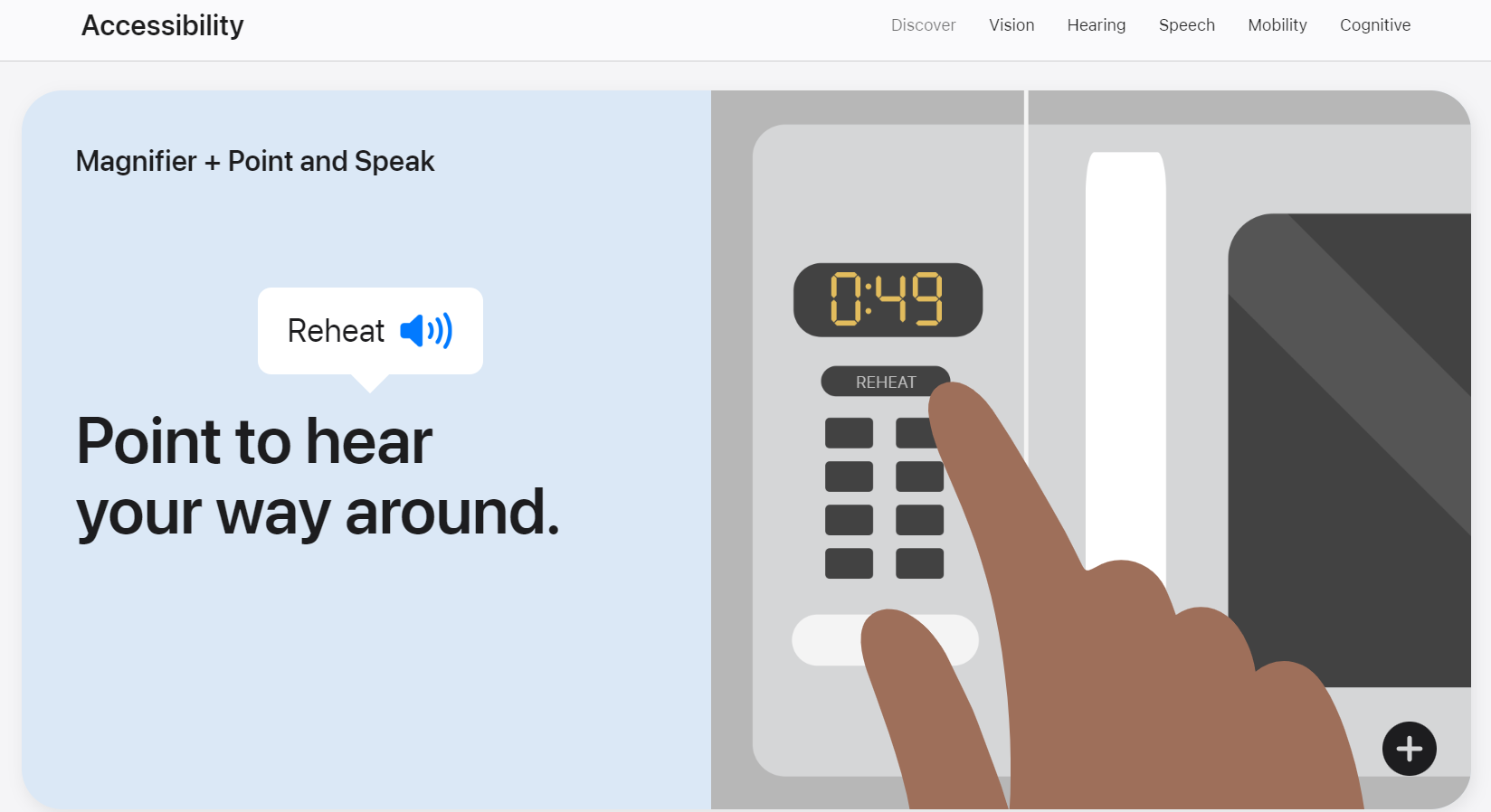
The Apple website hosts a suite of accessibility features and showcases just how accessible a website can be. For example, they have text magnifier + point and spread functionality, so users can “hear their way around” the website. They offer adjustable display settings, VoiceOver functionality, and Siri for shortcuts and commands.
3. Partake Foods
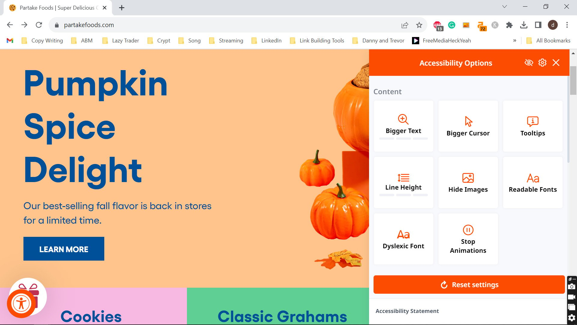
Partake Foods uses descriptive labels for form elements, making it easy to engage with their forms. They also make sure any multimedia on the site has text alternatives to allow VoiceReaders and image-to-text converters to access the website.
Furthermore, the website offers a whole suite of Accessibility Alternatives, such as text and cursor enlargers, font changes, text spacing, and preventing animations – all so that the user essentially has full control over their user experience while on the site.
4. ACLU
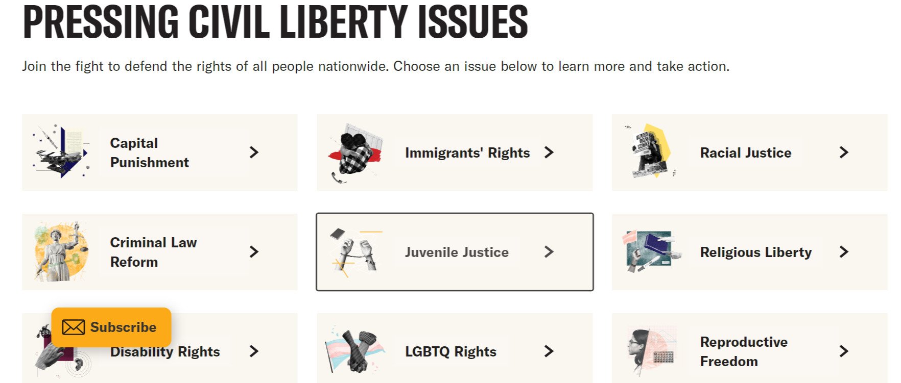
The American Civil Liberties Union (ACLU) Incorporates text-to-speech capabilities and offers a user-friendly interface that’s easy to navigate with assistive technologies.
They also offer keyboard user navigation (shown above), giving users an alternative to using the mouse, and they also pay close attention to their user feedback and improvements section, where they take onboard constructive criticism left by website users.
5. Harvard University
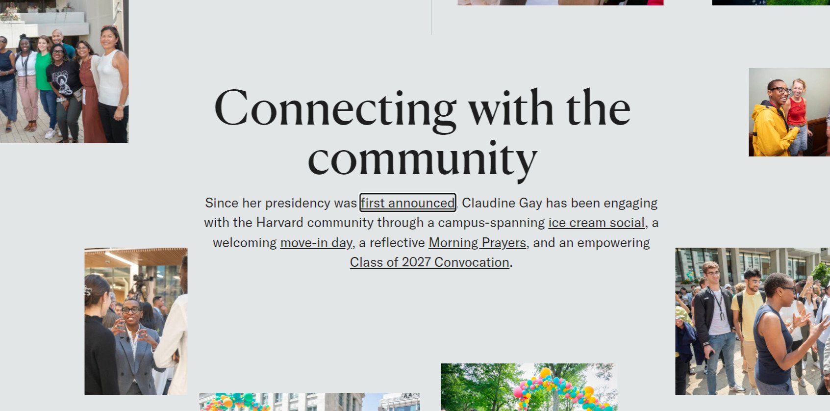
With more than just a clean interface, Harvard’s website is a great accessible website example because of how it provides closed captions, alternative text for all images, and also enables keyboard navigation.
6. WordPress

The WordPress website enables users to build on WordPress and to create WCAG compliant pages of their own. They do this by offering resources on how to achieve compliance, while also compiling useful lists of accessibility-compliant development tools, such as color blindness simulators of Mac OS X, and even tools to analyze color palette accessibility. They also have a section for web developers by offering website themes designed with accessibility in mind, including all new and updated code released in WordPress, which is accessible to as many users as possible.
7. Google
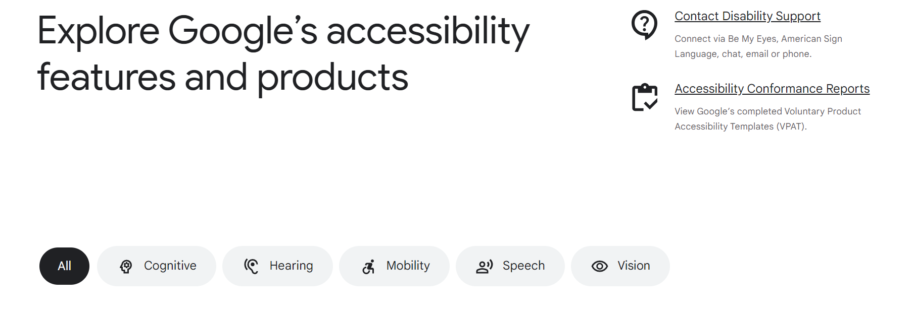
As the front-runner of the internet, Google is fully committed to making the World Wide Web as accessible as possible for as many people as possible. It does this by offering numerous accessibility features and products, ranging from cognitive to hearing, mobility, speech and vision accessibility features.
Some of the more incredible features, for example, Camera Switches on Android devices, include turning the front-facing camera into a switch, enabling the user to navigate their phone with eye movements and facial gestures! Other features include AI image descriptions, helping visually impaired users understand what’s been presented on the website.
8. AFB

The American Foundation for the Blind website is fully accessible by all users, including those who are visually impaired or have color blindness. It’s made so by inbuilt screen readers, and their vast library of resources on how to make a website accessible.
Videos are described and subtitled, and they provide transcripts for any video content on the site. Also, they have accessible “flyout” menus that work seamlessly with mouse users, touch screens, visitors with low vision, and any user using screen readers.
9. Patagonia
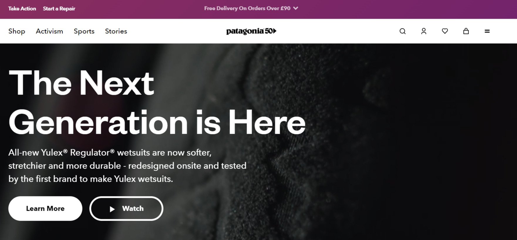
The Patagonia website is a great accessible website example of how it emphasizes a user-friendly design with clear product descriptions and alternative text for images. This enhances the user’s and shoppers’ experience, but it also helps the website in converting more shoppers because they are able to successfully interact with the website and its content.
10. Snack Nation

SnackNation’s website is designed with a cognitive disability profile in mind, which ensures that users with cognitive challenges can navigate and understand the content easily.
This also has beneficial knock-on effects for all other users, as an intuitive layout and interactivity procedure make the website more enjoyable for all users.
11. Aura
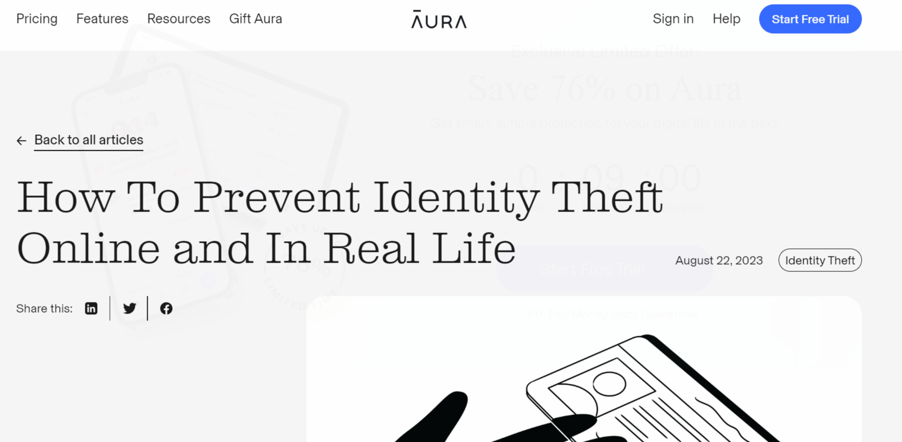
Aura’s website, specifically its blog posts (e.g., identity theft protection page), is an excellent example of an accessible and easy-to-read blog post. While most of the other accessible website examples shared in this list are of landing pages and for website design in general, creating accessible blog posts is just as important.
With a significant focus on the reading experience, Aura’s blog posts have no extra pop-ups, unnecessary images, or banners that could detract from and possibly confuse particular users. The design and layout are simple, easy to digest, and, importantly, optimized for mobile.
12. Might Networks

Mighty Networks helps people bring their products together into a powerful community, but their website also assists screen-reader users by implementing AIRA tags and alternative text descriptions, ensuring all users always know precisely what’s going on on the webpage at all times.
13. Riverside
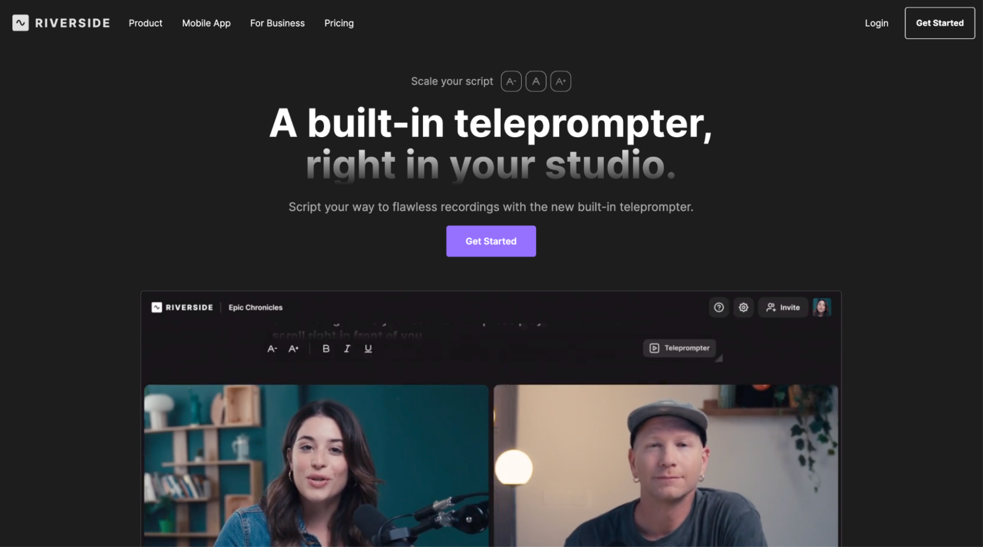
Riverside is a platform that allows users to record high-quality video and audio podcasts, interviews, and other content remotely.
The website’s high contrasting colors make reading and scanning the page easy (e.g., Riverside’s online teleprompter page).
What’s more, the content is divided into blocks that make it easy for users to identify and consume the key information. Importantly, the beautifully designed page is mobile and tablet-friendly, working just as well on devices as it does on a desktop machine.
14. MYSA Skincare
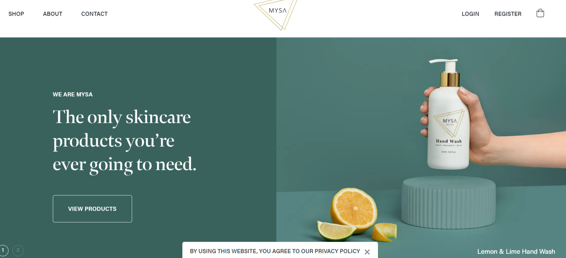
The MYSA Skincare website stands out as a beautifully branded, but seamlessly accessible website example for several reasons. First, their high-contrast colors – particularly as it relates to text, makes reading the content an enjoyable breeze. The images with alternative text, ARIA markers, and elements utilizing the appropriate labels all contribute to making this website accessible yet stylish.
15. Nextiva
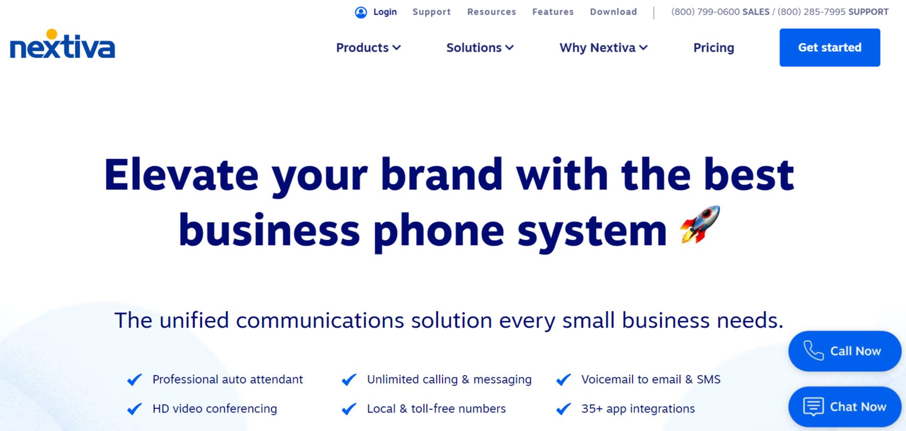
Nextiva’s clear, clean interface and design is optimized for mobile devices and also offers plenty of ways to connect with the company. With clear CTAs, “Call Now” and “Chat Now” make it clear to the website user that the customer support team is responsive and ready to engage.
16. Identify Guard

Identity Guard’s blog post design is yet another example of an accessible website going that extra mile, making sure every element of its user experience is optimized for as many users as possible. The reader is clearly encouraged to read the material without needing interruption from pop-ups or CTAs that aren’t relevant at this point in the customer journey.
17. Internxt
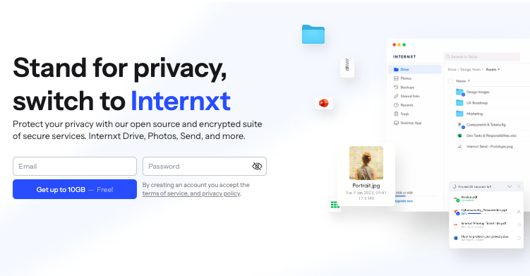
Internxt is a cloud storage company with a mission to make online privacy and security accessible to everyone. To achieve this mission, Internxt has designed a website with ease of use and accessibility in mind.
Internxt’s products are tested in the design phase to ensure the platform is accessible to users who are color-blind by verifying how the web page will look from eight different perspectives of color deficiencies and making changes if necessary.
To show its commitment to accessibility, Internxt recently changed the font of its platform to a more user-friendly one to increase readability for its users.
Conclusion
Creating your website with full accessibility in mind helps you broaden your website’s reach, and also demonstrates your commitment to helping as many people as possible. By following the precedent set by the accessible website examples shared in this article, you have a great foundation from which to build your own accessible website.