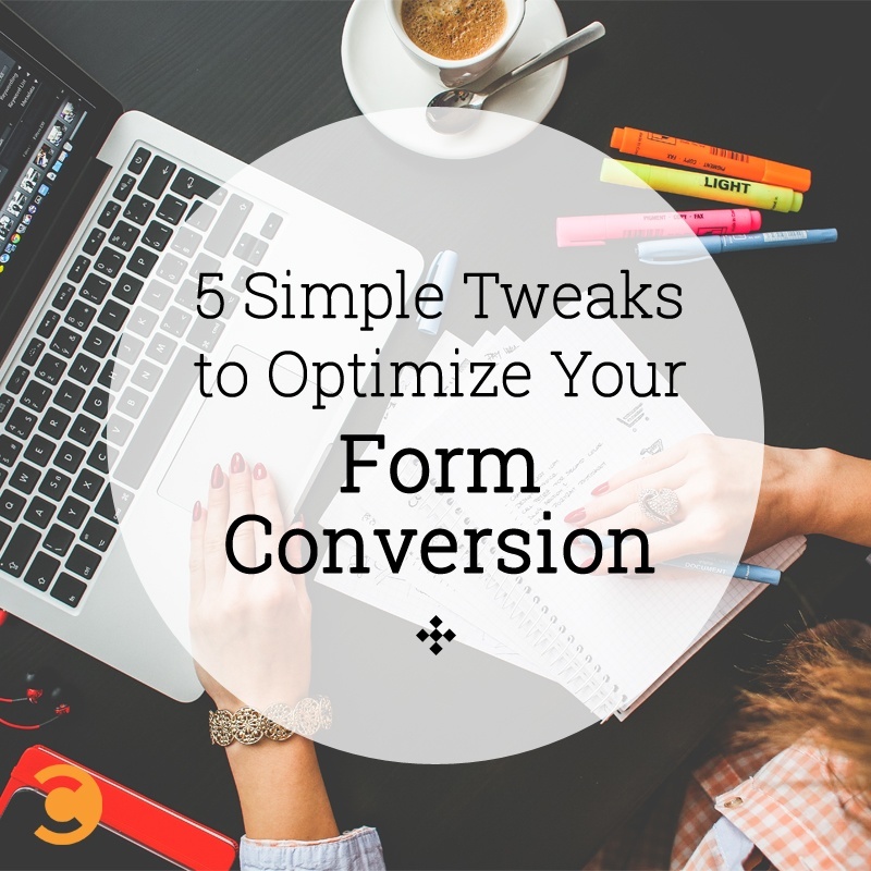
When it comes to form conversions, small changes can make a big difference. A few minor modifications to your form’s design, messaging, or layout can lead to major gains.
By using a measured and strategic approach to deploying these changes (and keeping track of what works), you won’t just make an impact on your current campaign—you’ll create a roadmap for success in future projects.
To help kick off your own Project Conversion, here are the top five form areas to optimize today.
Call to Action
As marketers, we want to make our communications with customers as turnkey as possible. This isn’t the time to be obscure. When a visitor reads your form headline, it’s important they know what to do next. Don’t be afraid to spell it out!
Case in point: When Mozilla Firefox changed its call to action from “Try Firefox 3” to “Download Now – Free,” it outperformed the original by 3.6% percent and had a confidence level of over 99%, resulting in 500 more downloads during Mozilla’s testing period.
Conversion Buttons
Your form button is the final touch point between your user and form submission. For best performance, make your text specific. Our 2015 Form Conversion Report found more specific button text correlated with higher conversion rates. Instead of using generic words like “send” or “submit,” try button text that’s form specific, such as “send application” or “register now.”
You should also display that specific text in all caps. This creates balance from left to right and ensures even letter height by eliminating ascenders and descenders in your text.
Finally, make your button pop. Select a contrasting button color that coordinates with your brand palette. Adding hovering-enabled movement or color change gives the indication that a button is clickable.
Seals of Approval
As consumers (and as humans), we look to others to support our decisions. It’s an important part of social behavior. It’s also an important tool to help marketers cultivate customer trust in their brand—and faith that any personal information shared with the company via online form is secure.
With that in mind, prominently showcase guarantee seals and third-party security certifications (Better Business Bureau, VeriSign, etc.) in your form. Not only does it cultivate trust in your brand, but it has a measurable impact on your business, as well. When eyeglass and lens company ACLens began to promote support from VeriSign, it saw a 41% increase in conversions and a 58% increase in revenue per transaction.
Images
As humans, we’re all hard-wired to be visual. For instance, 90% of the information that comes to the brain arrives via our optic nerve, and that visual data is processed 60,000 times faster than information our brain receives in text form.
Take advantage of this natural instinct, and hold visitors’ attention and interest by adding visuals to your form. Consider A/B testing an image series, and see which visual performs best. Or, test an image-free form: If images aren’t leveraged properly, they can actually hurt conversion rate. For example, if an image pushes your form down the page, it can create frustrations for mobile users that could result in form abandonment.
Layout
Yup, even your form’s design is ripe for optimization. Try various colors, experiment with fonts, or reorganize the orientation of your form layout.
This is a good place to deploy some A/B testing, too. You might do a trial run of one form layout against another, and then measure each design’s effectiveness in generating submissions.
Another option is to test the impact of added value on your conversion rate. See if a contest entry form or a survey submission outperforms your tried-and-true contact form. Our 2015 Form Conversion Report found that while a straight contact form only has a 1% conversion rate, contest forms convert at a whopping 35%, so odds are good you’ll see an impact.
To sum it up, your basic form is a smorgasbord of opportunities for optimization . Even a few tiny tweaks can make a big difference in your form’s performance. Take the time and effort to find out what really moves the needle for your audience and in your industry during this specific campaign, and you’ll be happy with the results!