 Guest post by David Hibbs, lifecycle marketing manager for integrated marketing firm Off Madison Ave. He specializes in developing strategies to reach the right customer, at the right time, with the right message.
I’m a big fan of Zappos.com. They have personality, transparency, and the willingness to try new things (see every social media case study). Zappos has extended the reach of their brand far beyond most advertising campaigns, while simultaneously culminating lasting personal connections with their audience.
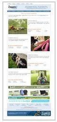 Zappos.com is a company known for their customer service and use of social media as a tool to communicate with customers, but how does their email perform? Does it continue the communication with their customers and build on that relationship? It’s important to note that sales is not Zappos’ number one priority – providing the best customer service possible is. Zappos wants you, the customer, to have an outstanding shopping experience every time you do business with them. Therefore, sales-oriented tactics are not included in this email audit and instead, I focus on the user experience.
Date: 06.09.2009
Subject: Free Shipping on Your Summer Sandals!
From: Zappos.com
Where’s the Preheader?
Let’s take it from the top. Zappos doesn’t use a preheader in their emails. Preheaders are generally used to view the email in a browser or offer a text call-to-action about the promotion. Sometimes they may ask for whitelist status or enable you to share the email with friends and family. This area is useful to promote sharing the email with friends and utilizing the social sharing features that most email service providers have begun to integrate within their platforms. It’s one of the best features of email – the ability to share it with other people. Not to mention it’s an exceptional way to build your email lists, and spread your message.
As you can see in the ‘After’ image, we use the space that was already there so the email doesn’t get longer, but we’re still able to enhance the customer’s experience. Now it’s only a click away to view the email with images on as well as one click away from sharing a great discount with friends!
Header & Navigation
As we move into the header and navigation section, it’s nice to see that Zappos has optimized their email for people viewing from a preview pane. I clearly see the Zappos logo, and the promotion is just to the right. This reinforces the subject line mentioned earlier. I’m also made aware of their customer service with 24/7 phone support and a large window for returns. The very top navigation bar seems out of place, and even distracting.
It’s obvious those tabs are a low priority since the font size is so small. I recommend testing the email with and without these items to see how it effects email performance. Better yet, move the tabs down into the footer area. The lower and more prominent navigation is much better. It gets me right to their main categorical department pages so I can start shopping quickly for those hard to resist impulse buys.
Email Content
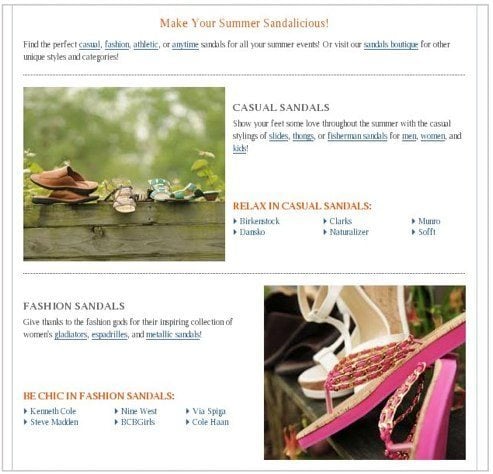
As we move down into the body of the email, we see the quasi ‘Table of Contents’ showing various sandal categories offered in the Zappos store. It would be nice to also test this area. We could easily find out if linking each type of sandals to the section below equals result. These sandals currently link to the respective section on the site which hopefully means the user is sure of what they want when they click, because once you click on the link it’s hard to find the other sandal categories on the landing page.
Each category section is essentially the same with a large image showing a display of sandals and links to either sub categories or brands. The quantity of content is optimal, and the links informative. I know exactly where I will be taken on the site if I make the decision to click. Zappos (Very wisely I must say) stayed away from the generic “Click Here” links that provide absolutely no value or clarity to the user. Their method of linking makes scanning the email for what I’m interested in very easy.
One minor downturn in the layout is the excess of whitespace. Zappos could have filled this space with additional product images for each category. Overall, the simplicity of the layout is quite nice, however.
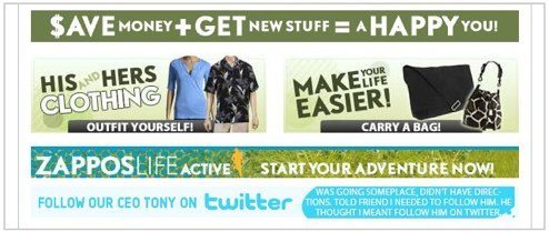
As we move further down in the email, it starts to fall apart. It seems like this section was just added to the email as an afterthought to fill up space. It contains more design elements than the rest of the email, the spacing is much tighter and none of the content seems to fit. Not to mention the disconnect between this content and the sandals above. Without any clear separation of the two, readers want to assume these sections relate. The “SAVE money + GET new stuff = a HAPPY you” and “ZapposLife Active” seem more like headers than a call-to-action link. It would have been nice to see a little more information included to clarify that one is a link to clearance/sale items and the other is a link to their publication/catalog. UPDATE: In their latest email, they changed the line “SAVE money + GET new stuff = a HAPPY you” to “Shop Clearance Shoes & Clothing.” Much better!
Footer
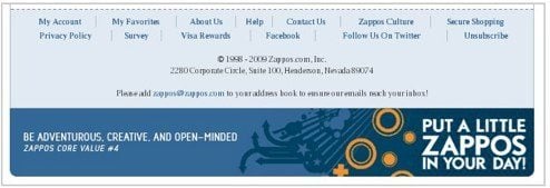
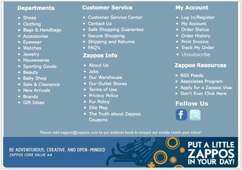
In the last section of the email (recovery and footer area) Zappos links to additional navigation items from the site. They also use this space to ask for whitelisting of their from email address. They could definitely use some improvement here. They include several links back to the site but no real order to them. As on their Web site, they could include links back to their main site per category. During the redesign of their site, Zappos research must have shown that organizing the content this way made it easier for customers. Why not carry that through to the email as well? It makes the email a bit longer, but allows the customer to quickly find the desired link.
In conclusion, this is a good email and a vast improvement from their previous text-only emails. I look forward to seeing how Zappos continuously improves upon their email communications to existing and new customers alike. Hopefully they even have a lifecycle marketing campaign in place like eMusic!

